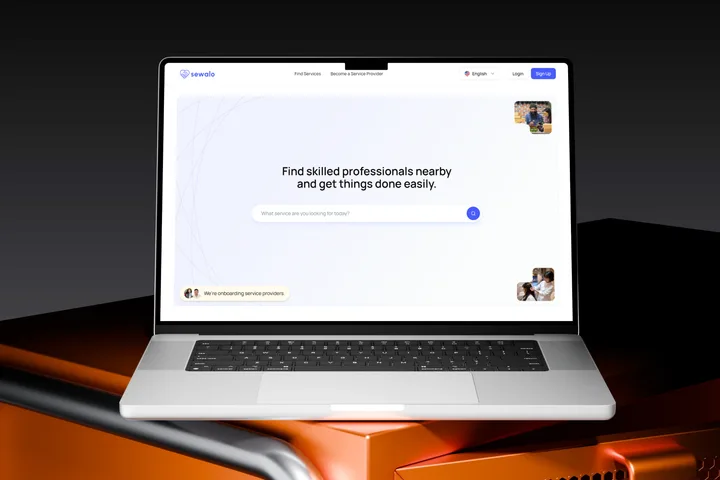
- Sewalo | Edgeoft Technology
- 2026
- UX Research & Redesign
- UX Research, Usability Testing, UX/UI Redesign
Sewalo lists local service providers across Nepal. I tested it with five of them — one to one, three tasks each — and the sessions turned up eight usability issues, six of them severe. Every participant praised how it looked. Several still had to ask what it was for.
What it is
Sewalo connects skilled local providers in Nepal — photo and video, IT, tuition, moving, fitness, beauty, design — to customers who book and pay through the platform. Which means it only exists if providers list themselves: that is the side I tested, and the side that has to work.
Sewalo is Edgeoft Technology’s own product. I ran the study and the redesign in-house there, and everything below shipped.
How it ran
- Five providers, matched to the categories Sewalo lists — a beautician, a teacher, a 3D artist, a motion designer, a designer-developer
- Experience from one year in the trade to over ten
- One-to-one moderated sessions, four in person and one remote
- Three tasks: first impression and sign-up, create and publish a service, work out what happens next
- Open feedback at the end, unprompted
- Run and moderated by me, April 2026
- Participants are quoted throughout under changed names
- 5
- 8
- 6
What came back
The visual design was not the problem — participants said so unprompted. Everything underneath it was. They could not tell what Sewalo was for, could not get through sign-up without hitting a button that did nothing, could not tell which fields they were allowed to skip, and once they had published, could not find out where the listing had gone.
“Glad you focused on user friendly and trustworthy design, rather than going after trendy dark modes.”
Nobody could say what it was for
Participants landed and asked what the platform did. Above the fold sat a headline and a search field — nothing on who it is for, what it costs a provider, or why anyone would list here rather than keep working through word of mouth. The cheapest problem on the list, and the one that gates the other seven.
Sign-up broke, and asked for too much
The Next button failed outright; one participant only got past it by restarting in incognito. Google-suggested passwords were rejected against an eight-character rule the form never stated. Then it asked for a date of birth, an ID and a location without saying why, with the terms unreadable until after agreeing to them. Two participants stopped there.
“I don’t trust this enough to give all my personal information.”
The service form read like a job application
“Service name” was read as a brand by some and a category by others. Pricing never said whether it meant per hour or per job. Duration’s unit sat in a field people missed, so they typed the unit into the number. The time picker offered every minute of the day. And education and experience — both optional, neither looking it — made the whole thing feel like a CV.
“It feels like I’m building a resume.”
Publish, and then silence
After publishing: no confirmation, no preview, no account of how a customer would ever come across the listing. Participants asked where it had gone; one tried switching to the customer view to check it existed. They had just handed over their trade and their ID against a promise of work, and the product said nothing.
“How will customers find me?”
The rest of what the sessions found
- Errors said “unexpected error occurred” and nothing more
- Uploads failed without naming a size or format limit
- The same action gave different feedback in different flows
- Location could be set to a nearby area, never an exact pin
- In the finance section, “account name” was read as the bank’s name
- Long pauses throughout: too many decisions at once, with no sense of progress
The redesign
None of this asked Sewalo to look different. It asked the product to explain itself at the six or seven moments where it didn’t.
Somewhere to explain at length
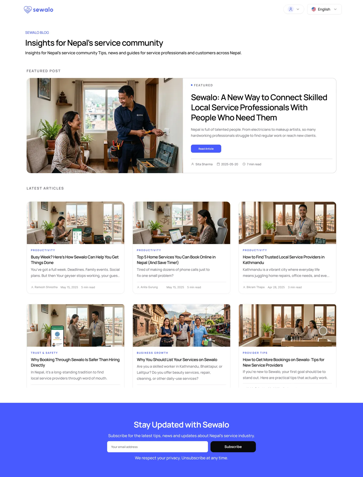
Participants asked out loud whether this was safer than hiring someone directly, and what listing would actually do for them. No landing page answers that on its own, so the blog template gives it somewhere to live: a featured piece, a browsable grid, a subscribe band at the foot.
An onboarding that introduces itself
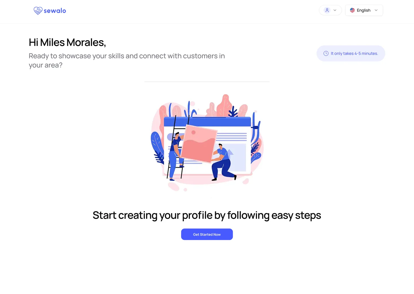
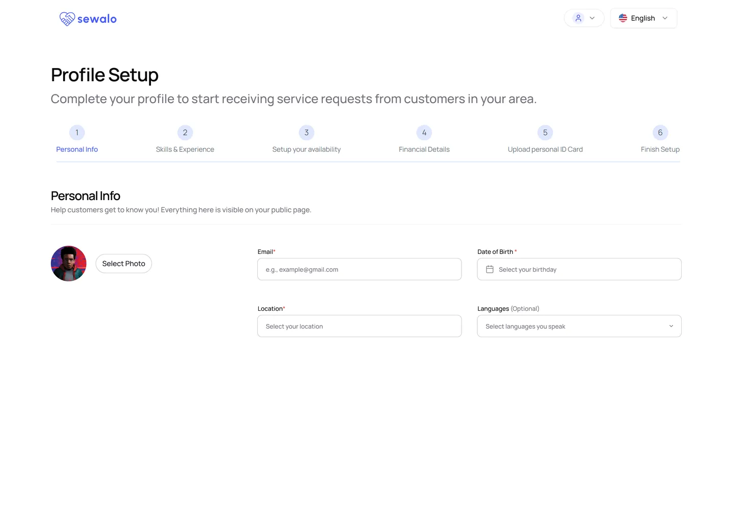
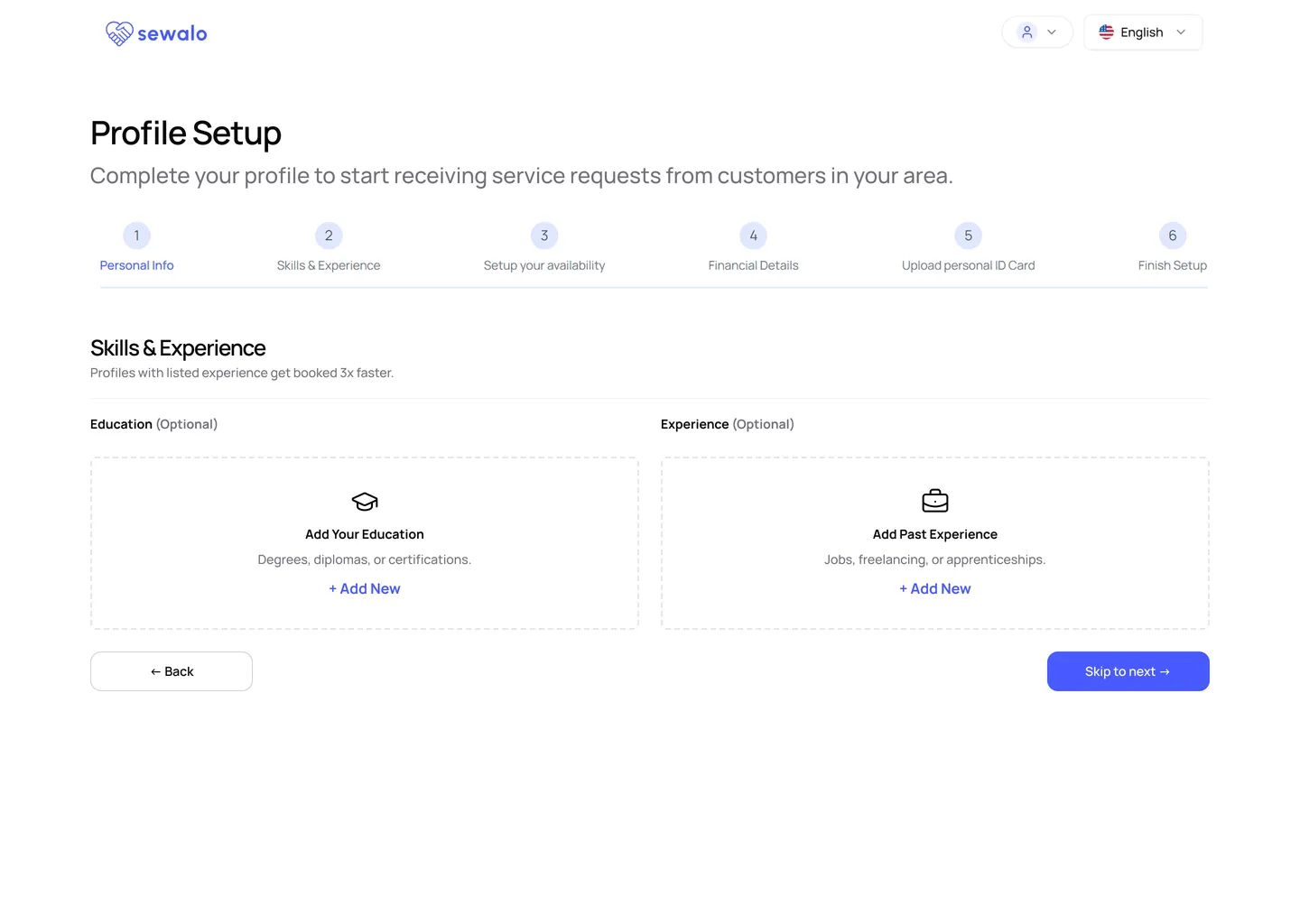
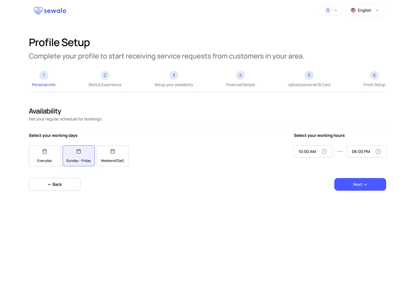
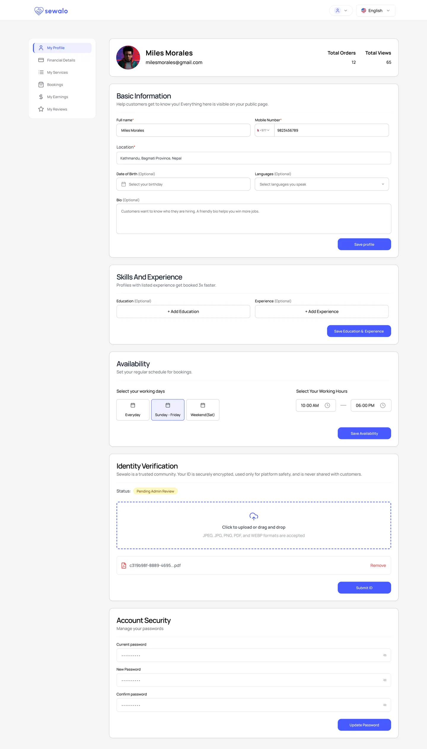
Setup now opens by saying what is about to happen and how long it takes, then runs as six named steps rather than one form of unknown length. Optional means labelled, skip is the primary button, and availability is presets instead of every minute of the day.
The steps that ask for the most
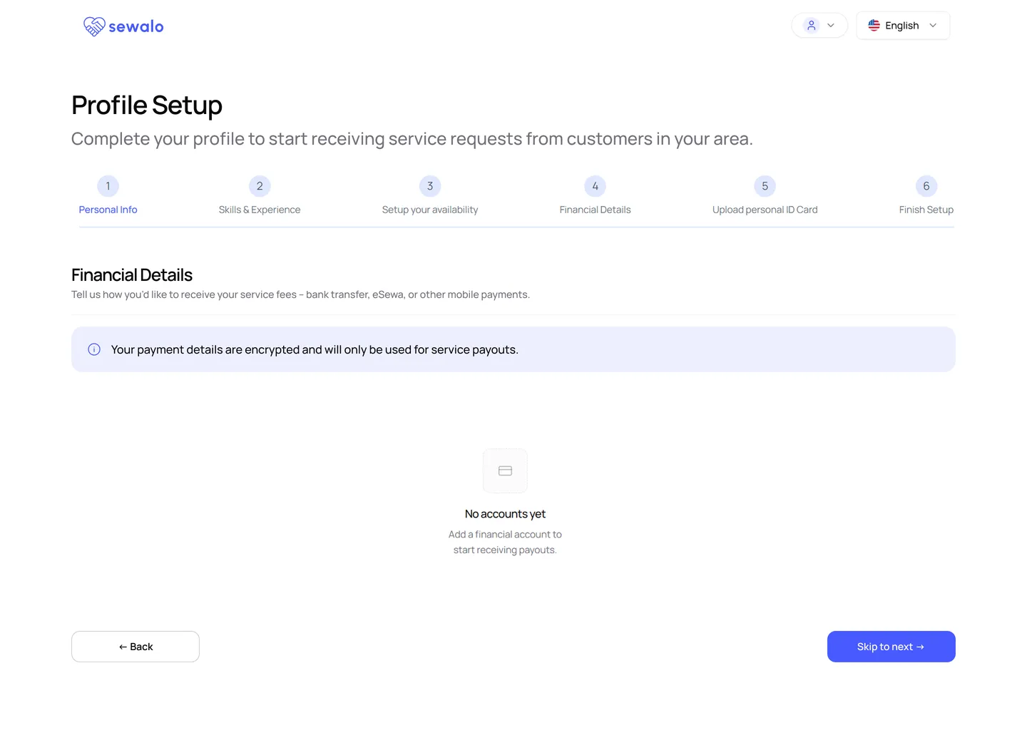
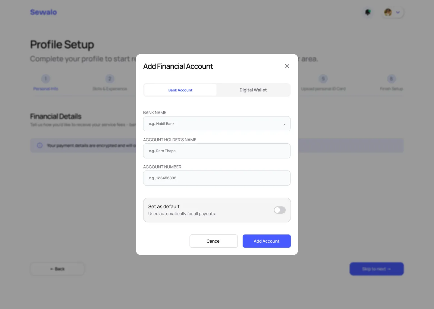
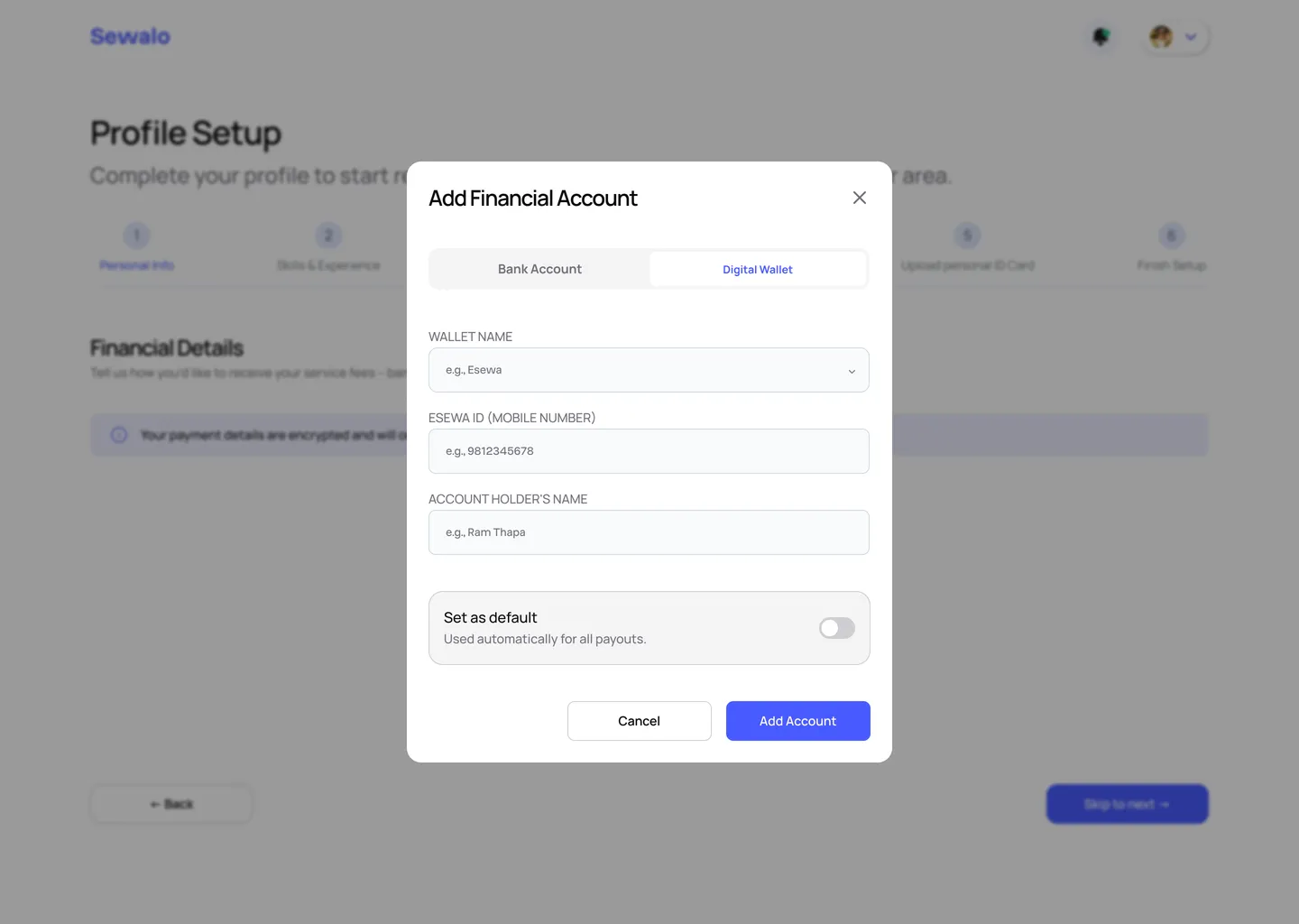
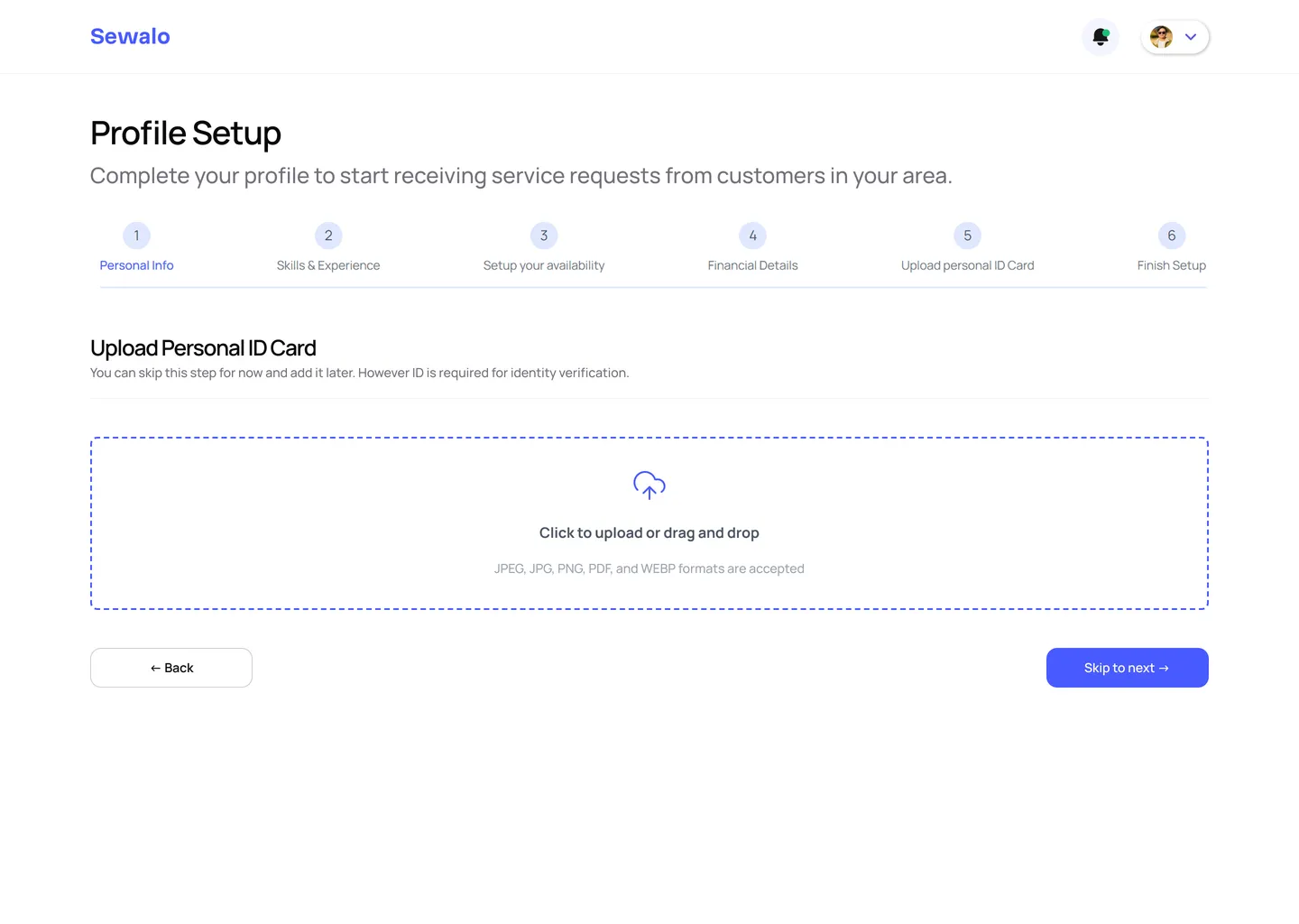
Bank details and a government ID are where participants stopped. Both now say what the data is for before asking for it, both can be skipped and returned to, the bank is chosen from a list rather than typed into the field that confused everyone, and the ID step states its accepted formats up front.
The service form, regrouped
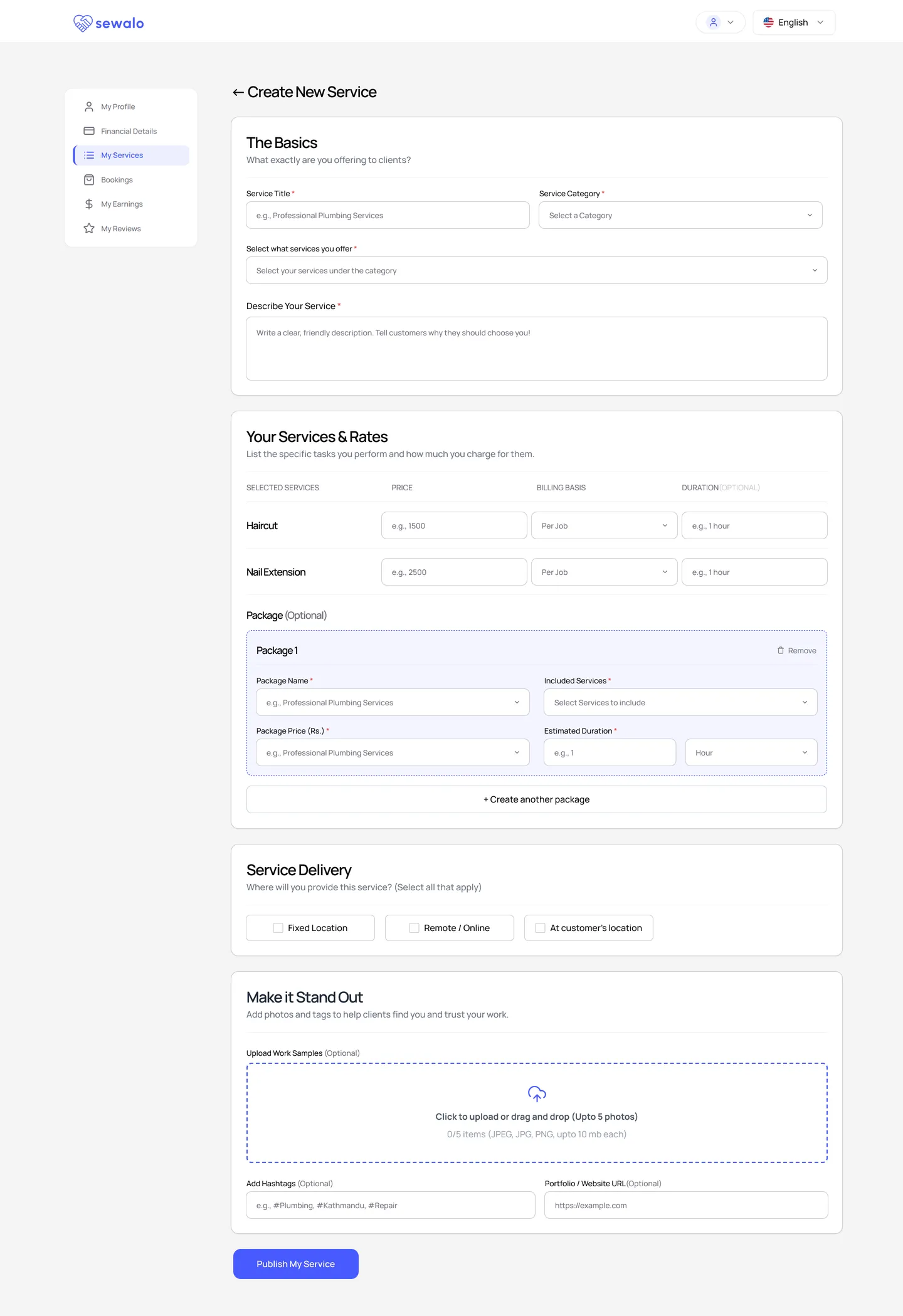
Four titled sections, each opening with the question it is asking. Service title carries an example, pricing gains a billing basis, duration shows its unit, and the upload states its limits before it is used.
And then, the thing they asked for
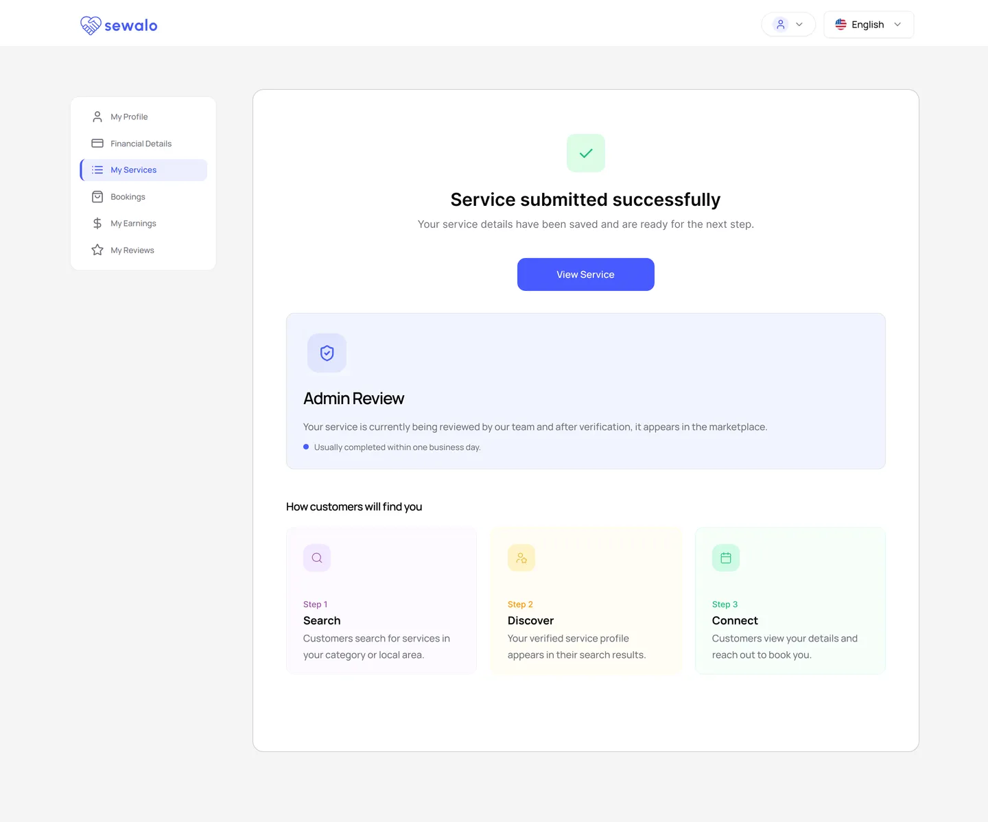
Publishing now confirms itself, says the listing is in review and roughly how long that takes, offers it as the customer will see it, and lays out the discovery path in three steps. A direct answer to a question a participant asked in a session, with nowhere in the product to look it up.
What these screens don’t yet cover
- Specific, real-time error messages across every flow — a states problem rather than a screens problem
- Password rules stated inline, and terms readable on the sign-up form itself
- An exact location pin on a map
- The category taxonomy rebuilt around real service types — the structure is in place, the content work is not
- A dedicated mobile experience, asked for unprompted by more than one participant
Next project
Envelope Collectives
An editorial portfolio for a wedding photography and film studio in Nepal.