Nepal Nexus
A redesign for a Kathmandu trekking company, rebuilt around the guide who founded it.
- Nepal Nexus
- 2026
- Redesign & Development
- UX/UI Redesign, Development, Admin
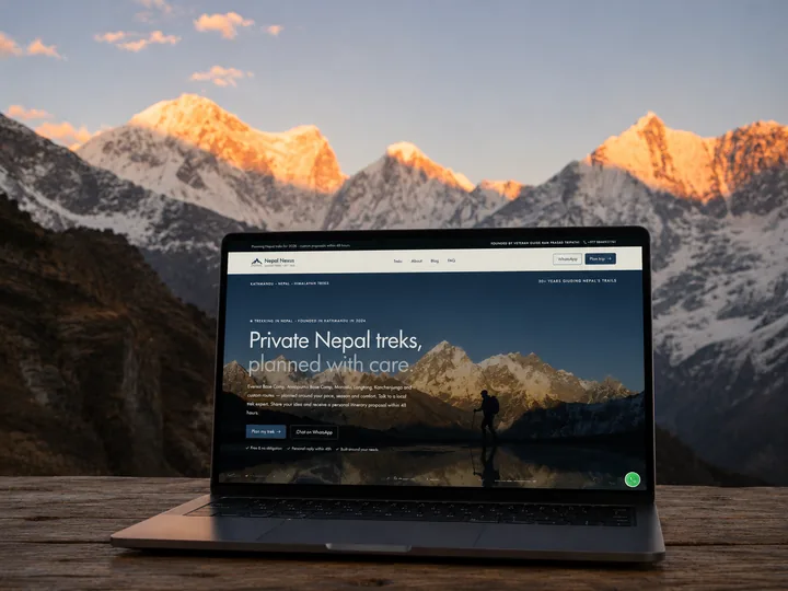
Nepal Nexus plans private treks out of Kathmandu, led by a founder with thirty years in the Himalaya. I redesigned and built the site around him, with a six-question planner in place of a contact form. Inquiries tripled.
What it is
Nepal Nexus plans private treks out of Kathmandu: Everest, Annapurna, Manaslu, Langtang, Kanchenjunga, and custom routes. It is for travellers who want the route shaped around them instead of being sold a package. Ram Prasad Tripathi founded it in 2024, after guiding in the Himalaya since the early 1990s.
The redesign was made at Aurora Studios. My part was the redesign and the build: the public site, the trip planner, and the back office the team runs it from.
What the old site got wrong
- Too few leads, and no easy way for a traveller to start one
- A hidden story: thirty years of guiding, and nothing on the page said so
- A template look that could have belonged to any trekking agency
Four rules for every page
- Lead with Ram. The founder is the reason people book
- One clear action, “Plan my trek”, in the same words everywhere
- Answer early: seasons, grades and costs before anyone has to ask
- Sound human, like a person writing and not an agency
The founder first
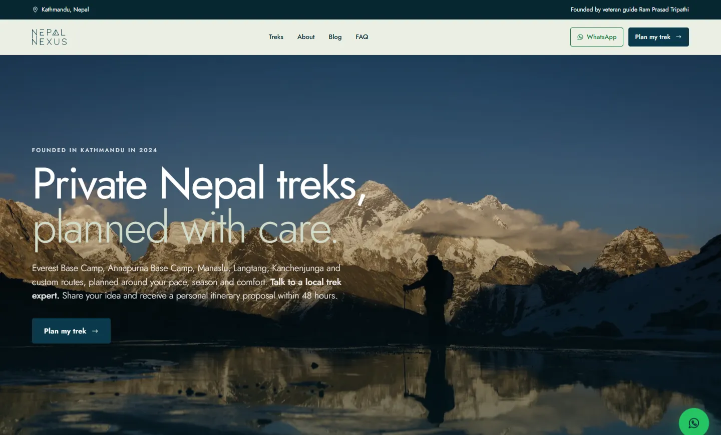
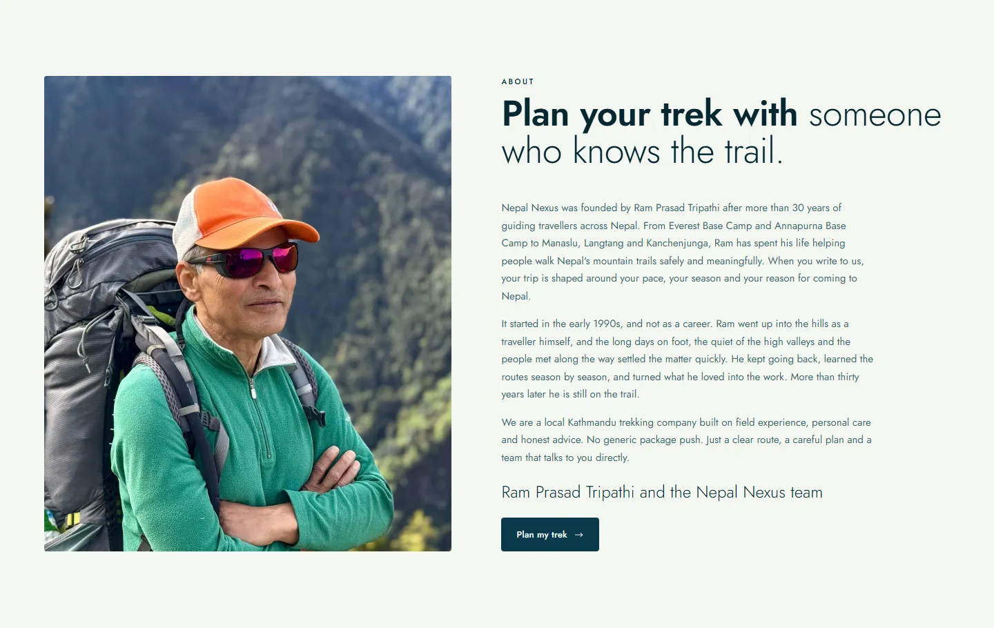
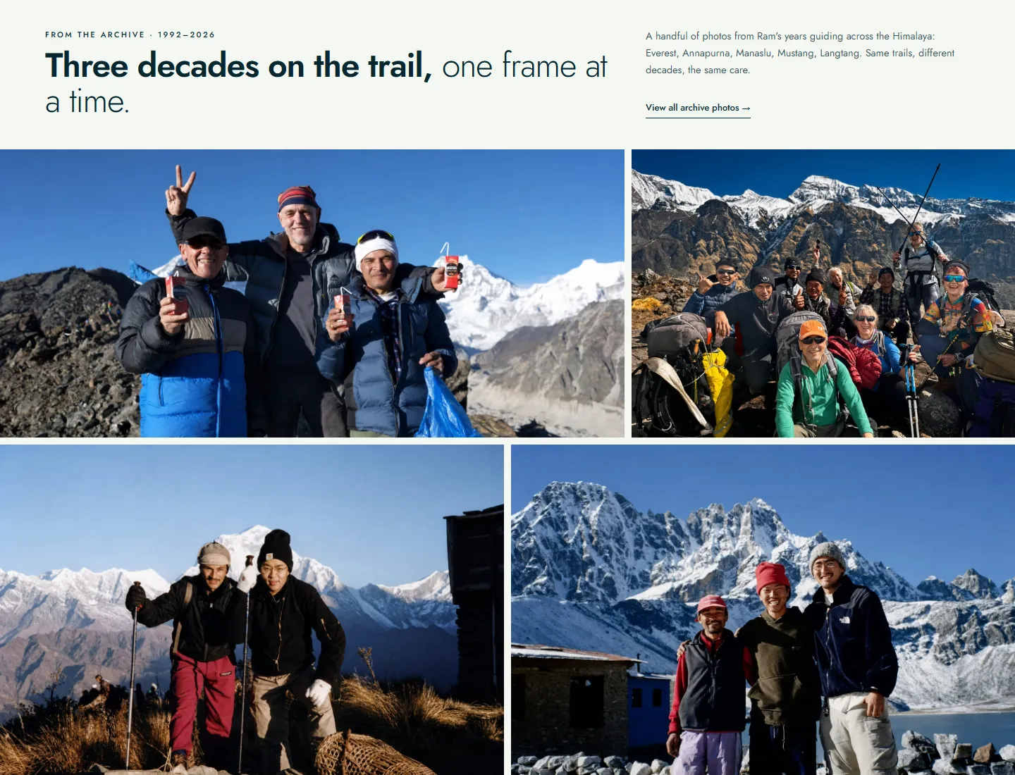
The old site hid its strongest argument. The new one puts Ram directly under the hero, with his photograph, how he came to guide and a sign-off in his name. Below that are three decades of his own photographs from the trail, 1992 to now.
Answer questions before they’re asked
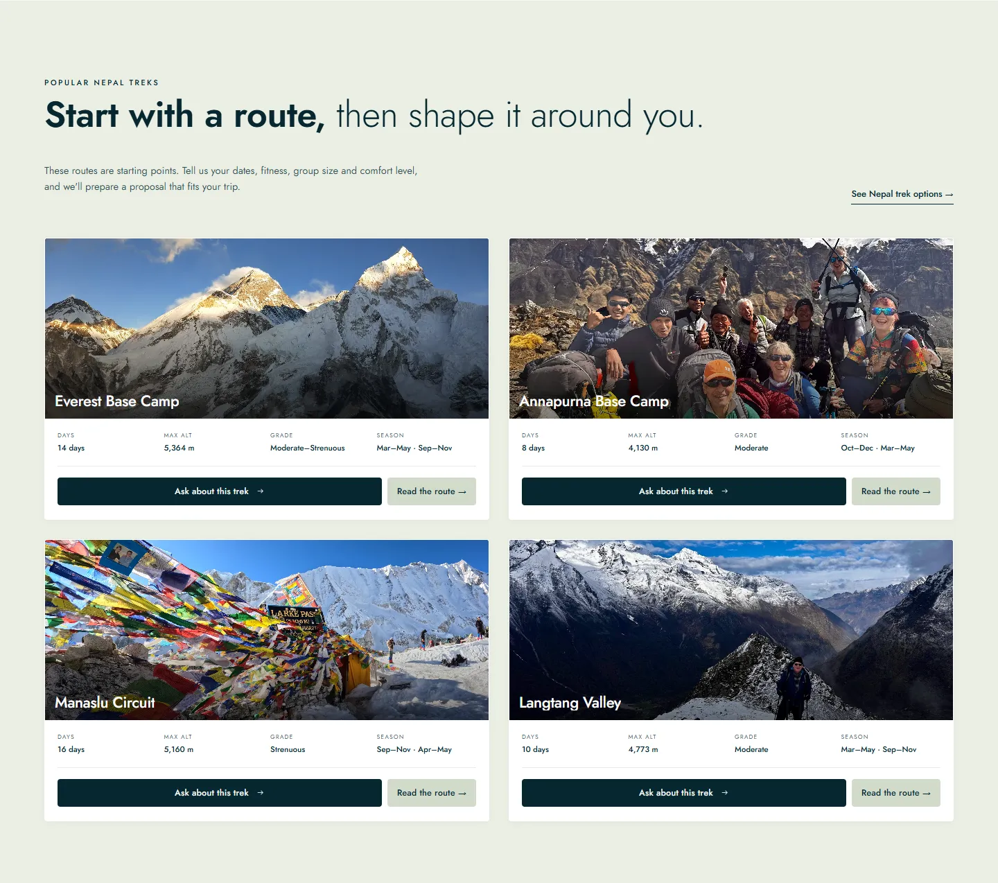
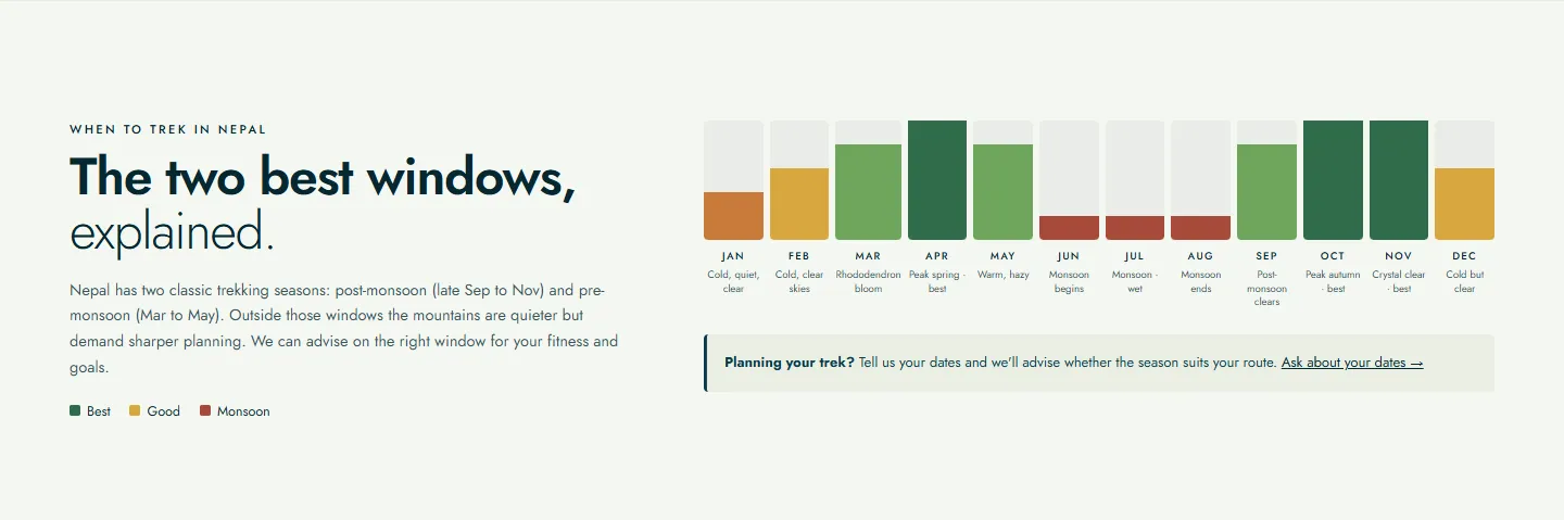
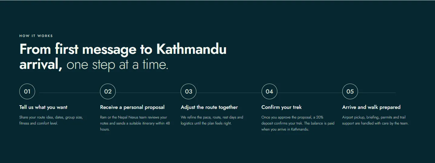
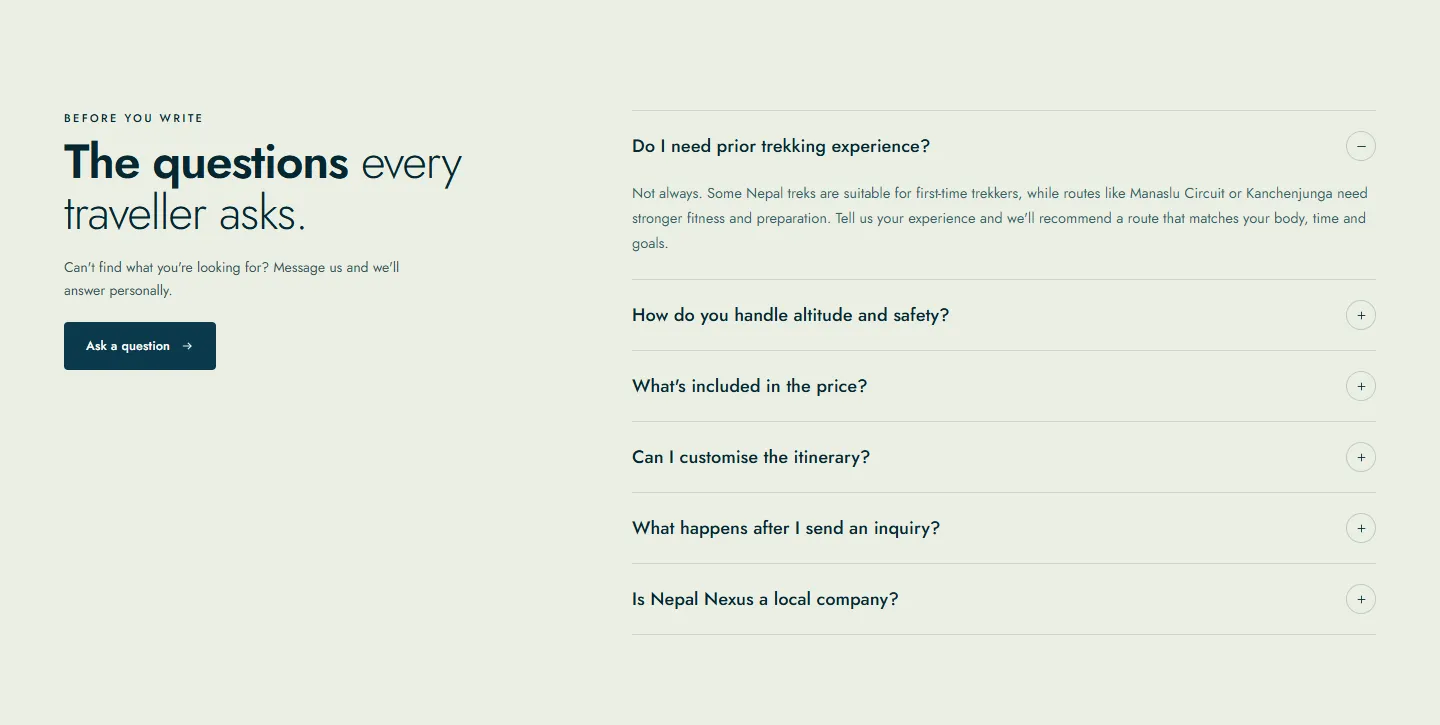
Travellers write to a trekking company with the same handful of questions: which route, which month, how hard, what’s included. The home page now answers each of them before the inquiry. Every route card gives the days, maximum altitude, grade and season. The two trekking windows are drawn month by month. The five steps from first message to arrival are laid out in order, and the questions everyone asks are answered in the traveller’s own words.
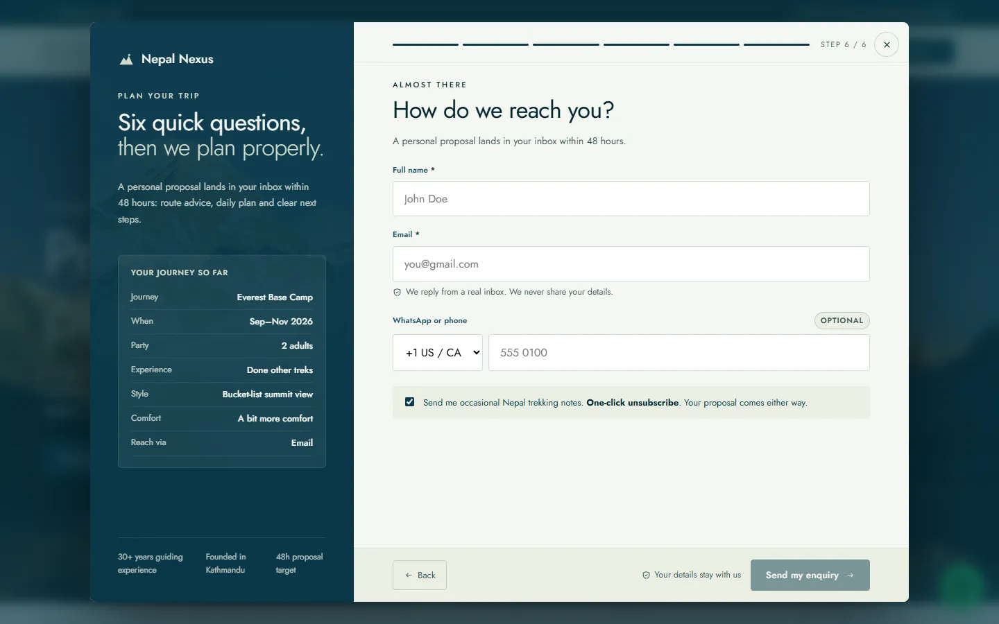
Six quick questions, not a contact form
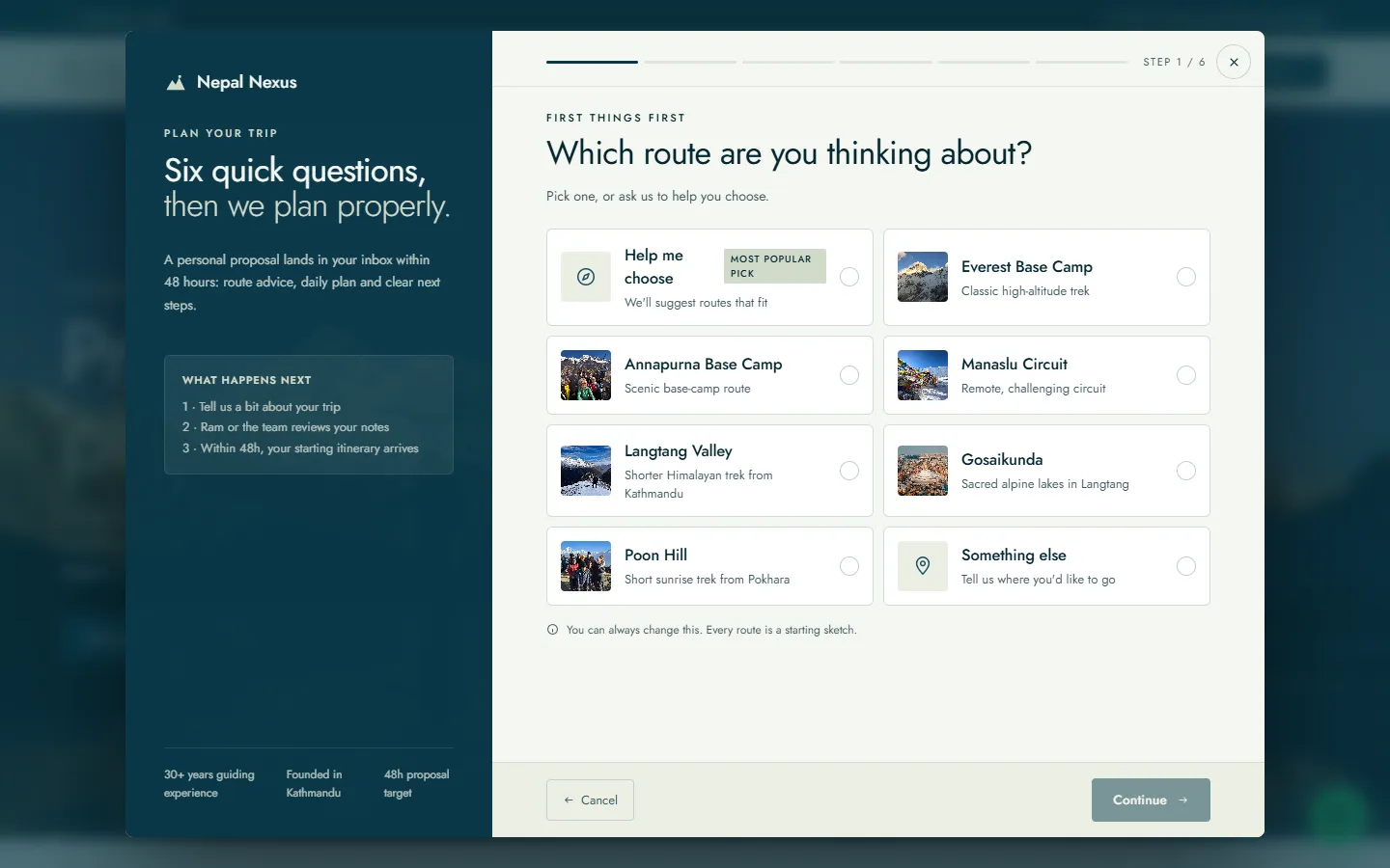
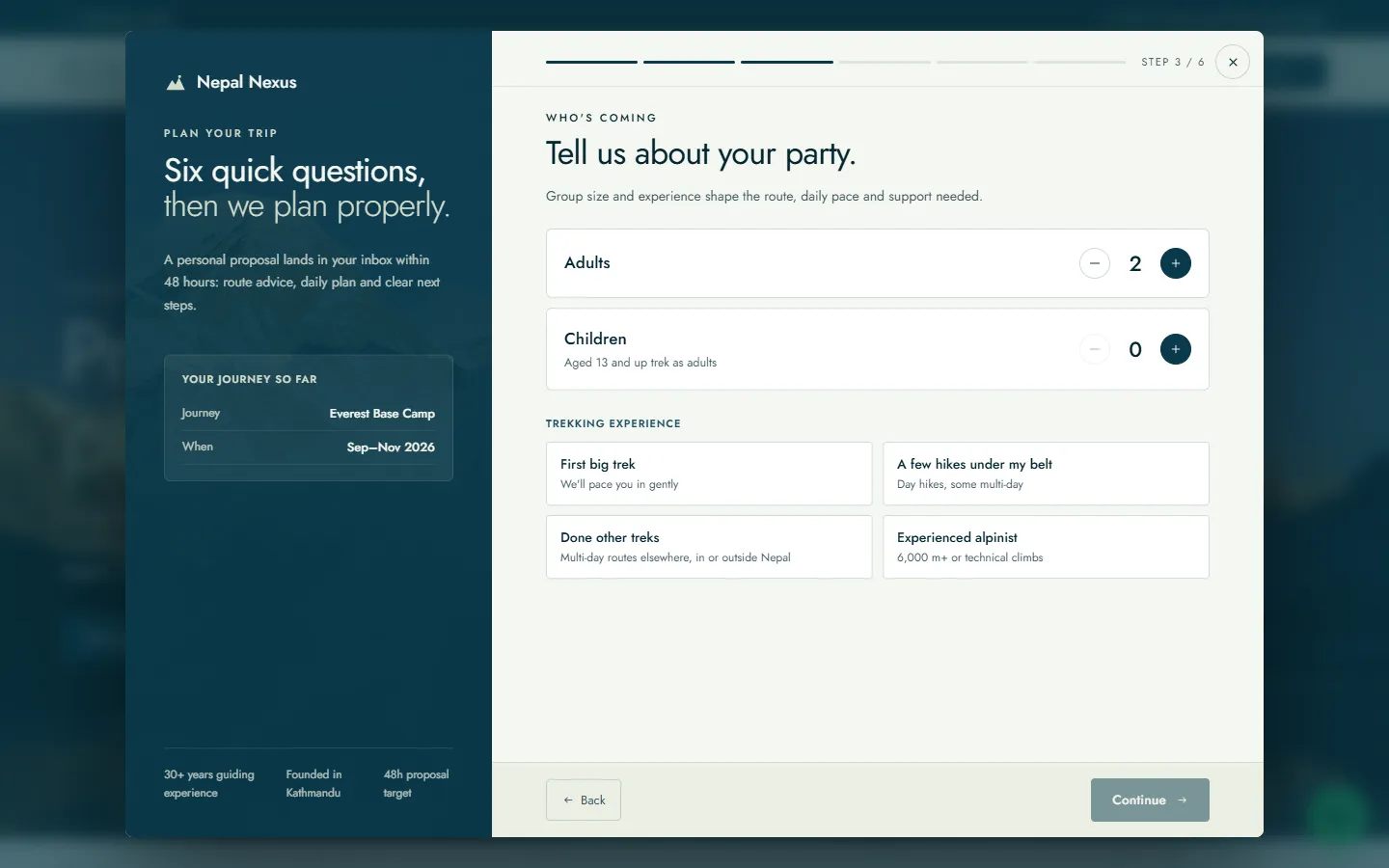
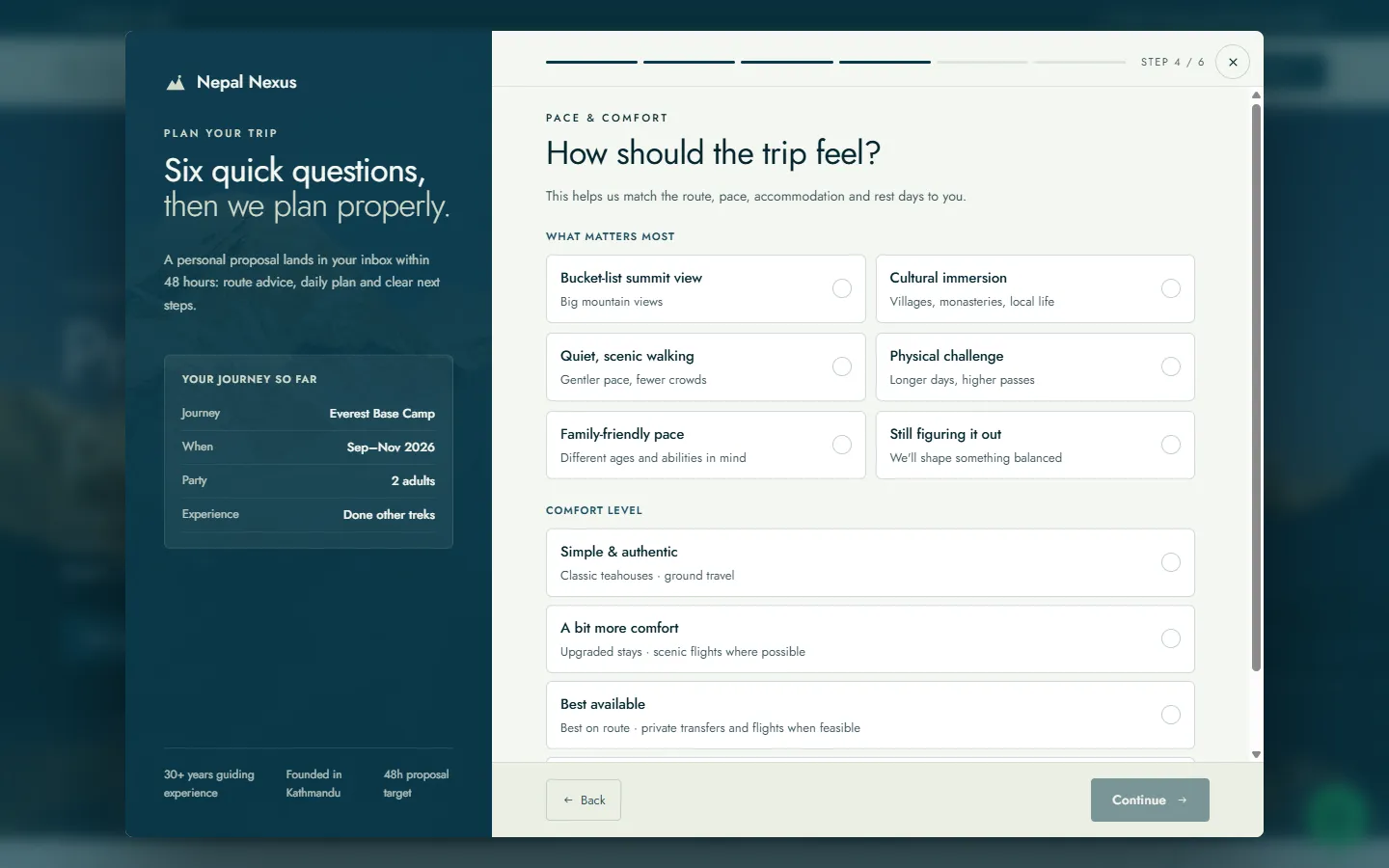
A contact form asks the traveller to write the brief themselves, and that is exactly the part they need help with. “Plan my trek” opens a planner instead. It asks about the route, the season, who is coming, how the trip should feel, how they’d like to hear back, and finally who they are. Every answer before the last is a tap. Each one appears in the panel on the left, so by the final step the traveller can see the brief they have put together, and the team receives a brief it can plan from.
Routes and a journal
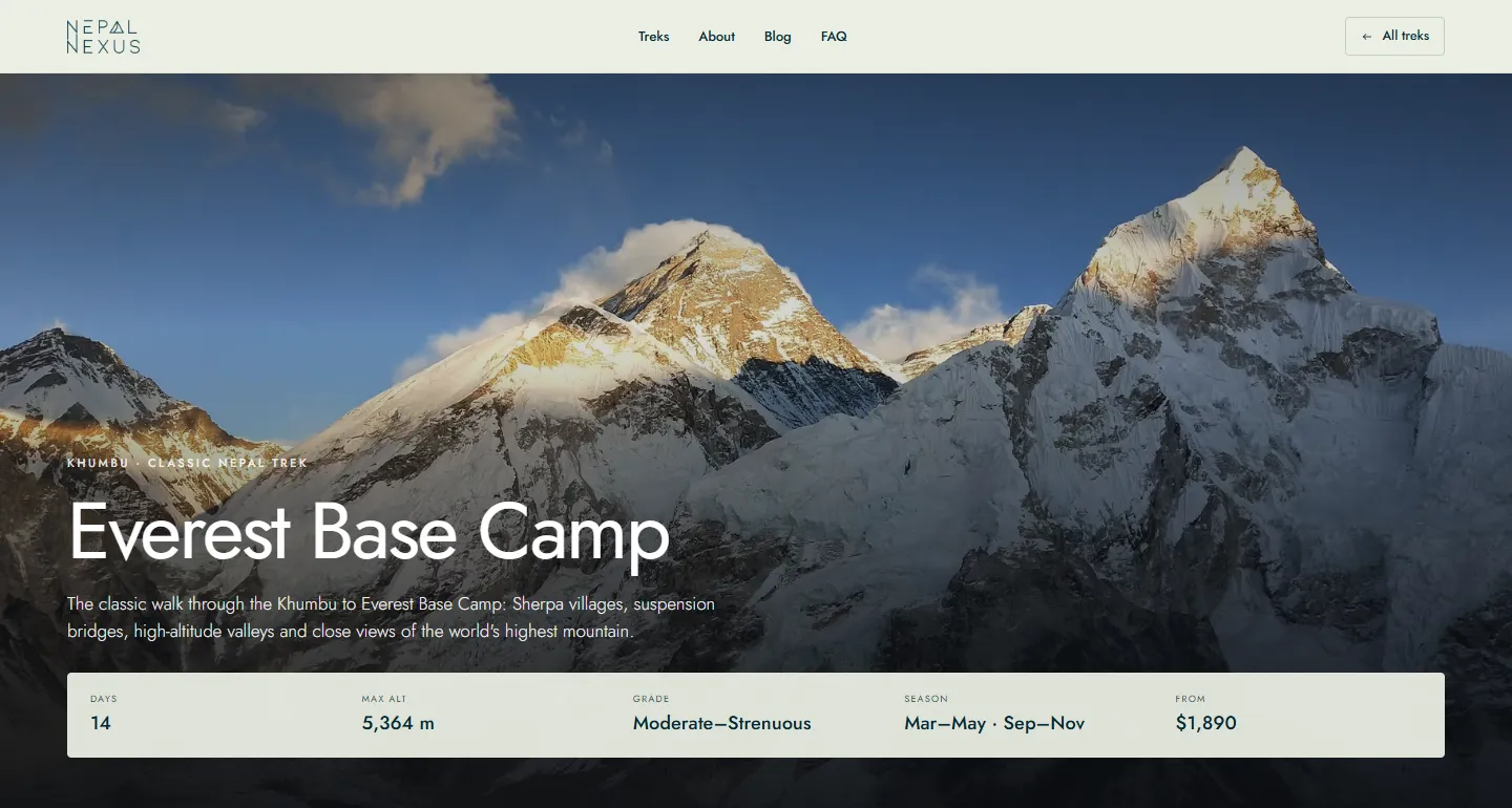
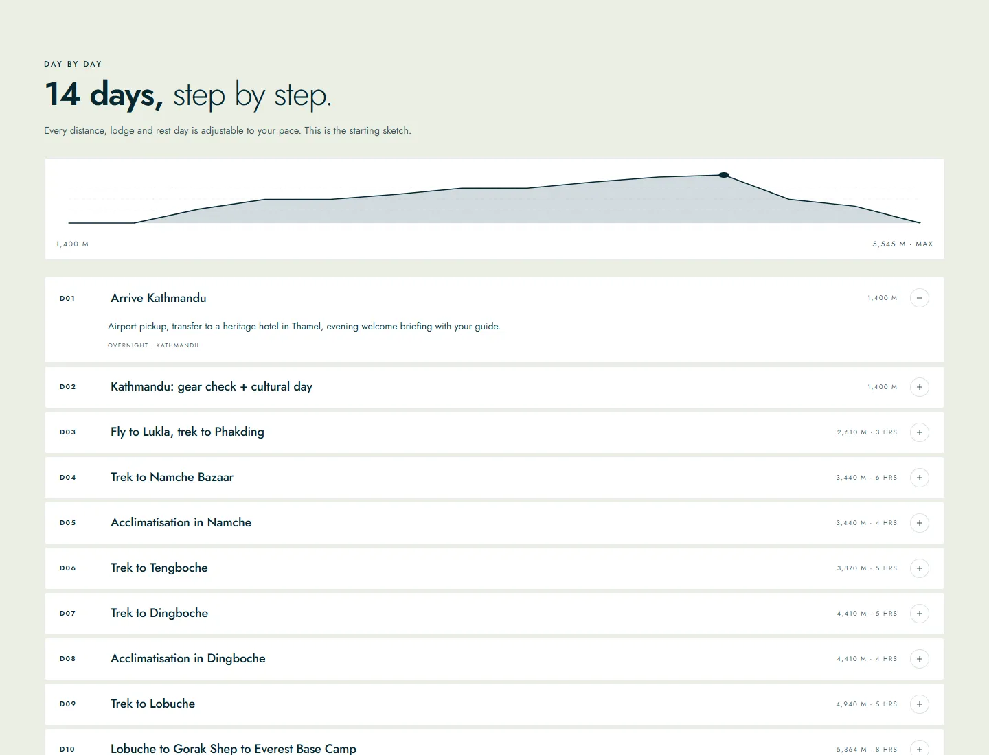
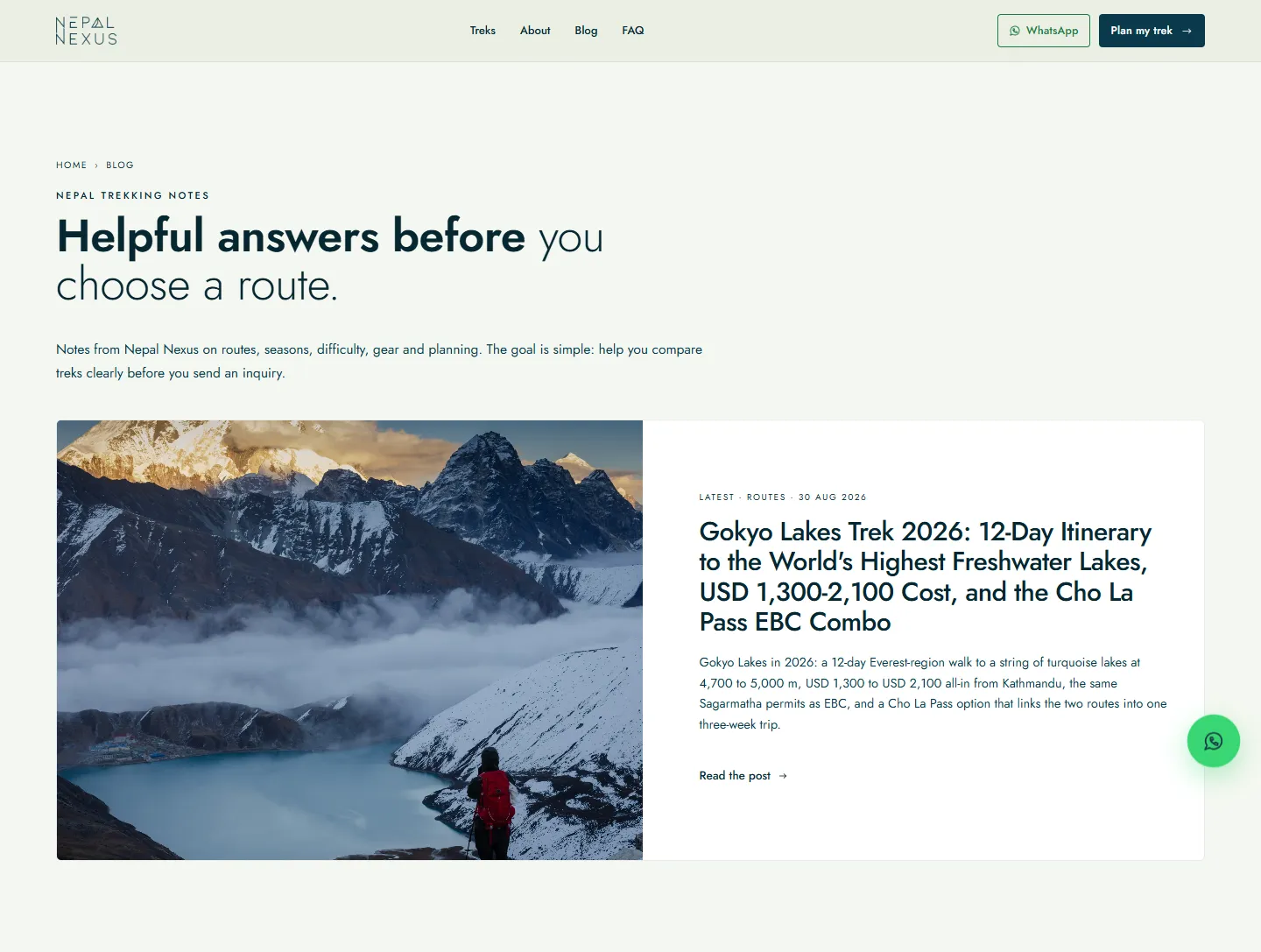
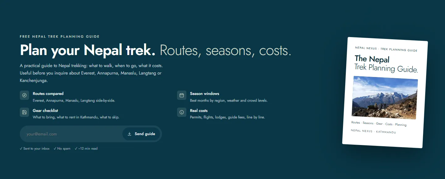
Each route has its own page, with the numbers at the top, an altitude profile over the day-by-day itinerary, and what is and isn’t included, line by line. The journal answers the questions that come before choosing a route at all. A free planning guide gives anyone who isn’t ready to write in a reason to leave an email address.
A back office for the team
Behind the site is an admin built around how the team works. The dashboard shows the pipeline: live treks, leads over the last thirty days, the funnel, where the leads came from, and proposals in progress. The lead inbox can be searched, filtered by status and exported, and a row opens the full brief. Proposals are kept by version. The site itself is edited there too: treks, blog posts, testimonials and the archive grid under Ram’s bio, and changes go live on save.
- 3x
- 6
- 30+
The outcome
Three times as many inquiries every month, arriving as briefs the team can plan from. The site now tells the story that was always there: a guide who has spent thirty years on these trails and is still walking them.
Next project
Sewalo
A usability study with five service providers, and the redesign it argued for.