Ahskid Portfolio
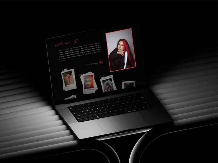
A portfolio for a makeup artist and creative director in Lisbon, made of red paperclips, paper prints and a signature.
- Ahskid (Diksha)
- 2026
- Design & Development
- Design, Development
Ahskid is Diksha, a makeup artist and creative director in Lisbon. I designed and built the portfolio: black, one red, a signature that writes itself, and thirty-seven shoots that open in place. Every shoot, in Diksha’s own words.
What it is
Ahskid is the working name of Diksha, a makeup artist and creative director from Ludhiana, Punjab, now based in Lisbon. The work runs across magazine features, editorials, brand campaigns and runway.
I designed and built the site, from the first layout to the Cloudflare deploy.
Diksha’s marks, not a template
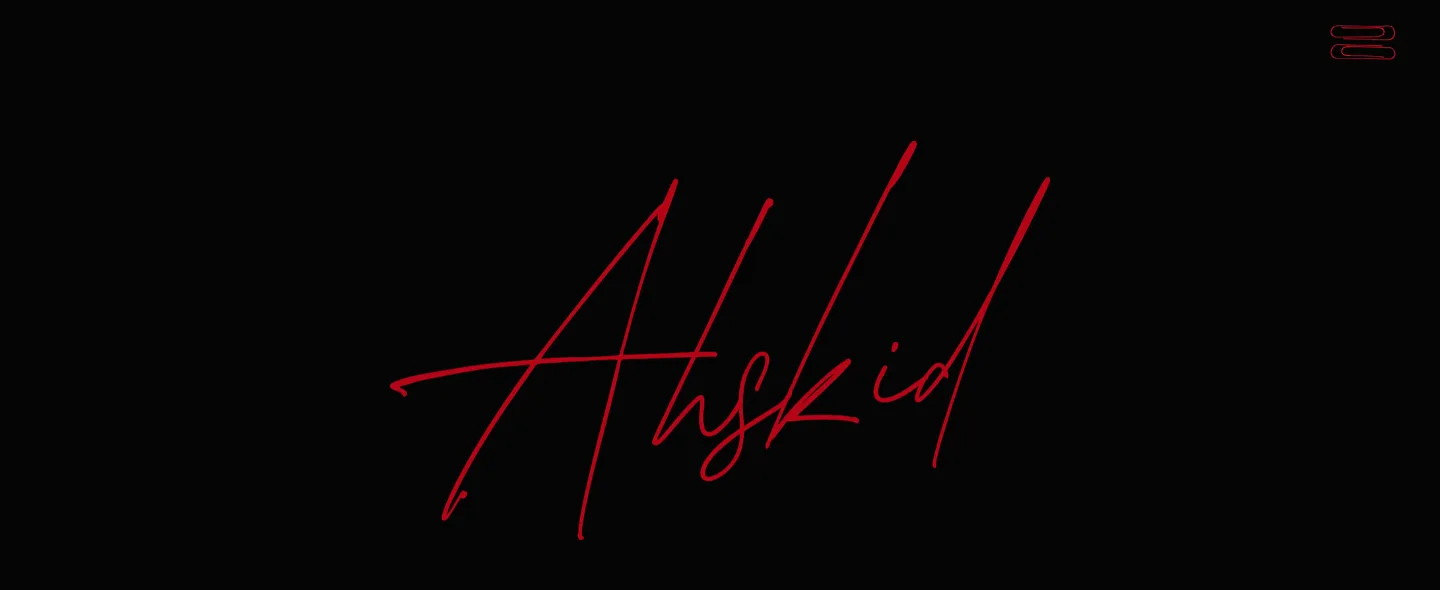
The site is made of things that are already Diksha’s: the Ahskid signature, red paperclips and paper. Everything sits on black, in one red, #ED272B, with grey for the text. Century 725 Condensed sets the titles, Callheart the script, Jost the text and Courier Prime the labels.
The first visit opens with the signature writing itself in red, from Diksha’s own animation. It runs on CSS alone, so a broken script can never leave the site shut behind the overlay, and it plays once a session: a ceremony on arrival, not a toll booth on every page.
A pinboard, not a grid
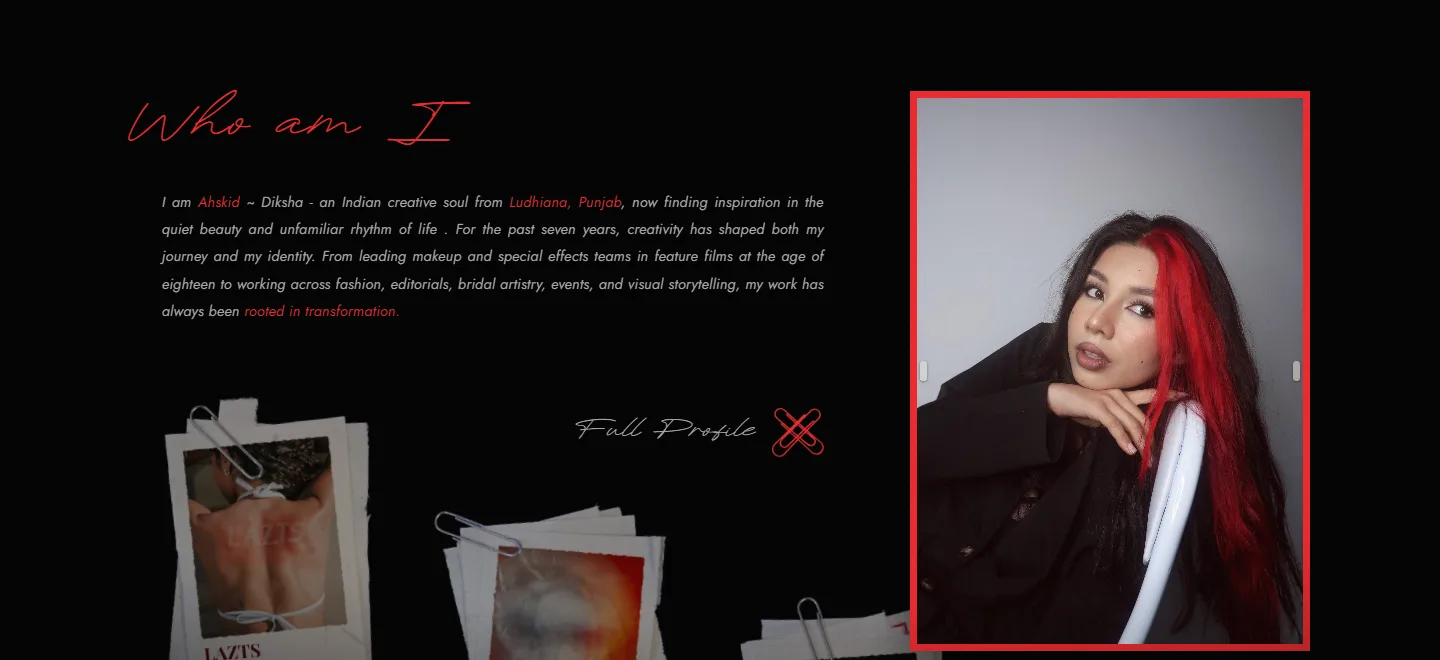
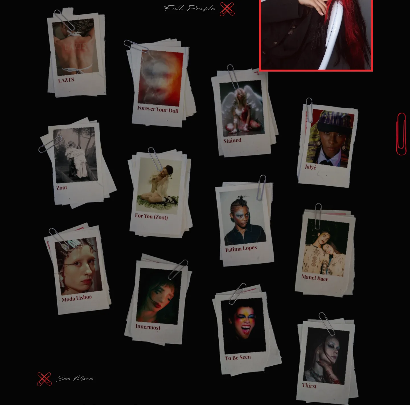
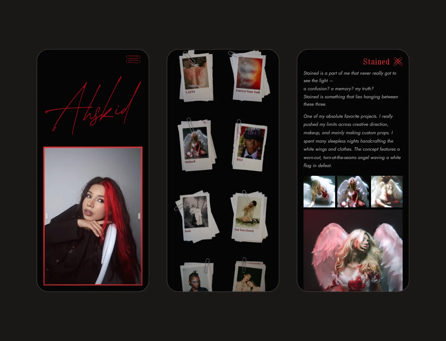
The work sits on the home page as twelve shoots pinned to a board. Each is a small stack of paper prints under a paperclip, tilted by hand and placed one at a time, in four loose columns.
The board rests slightly turned down, and the card under the cursor comes up to full brightness and lifts. A touch screen has no cursor to single one out, so there nothing dims. Below 760px the board becomes a two-column scrapbook.
Paperclips for navigation
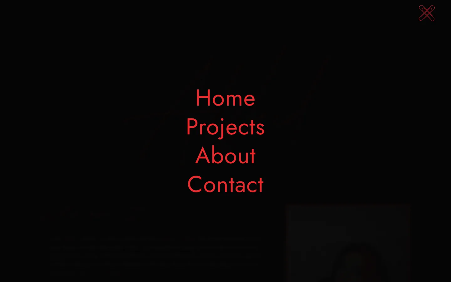
There is no nav bar. Two red paperclips in the corner open a full-screen menu, and swing into a cross to close it. The same crossed clips mark every close, every divider and the favicon.
Filed the way Diksha files it
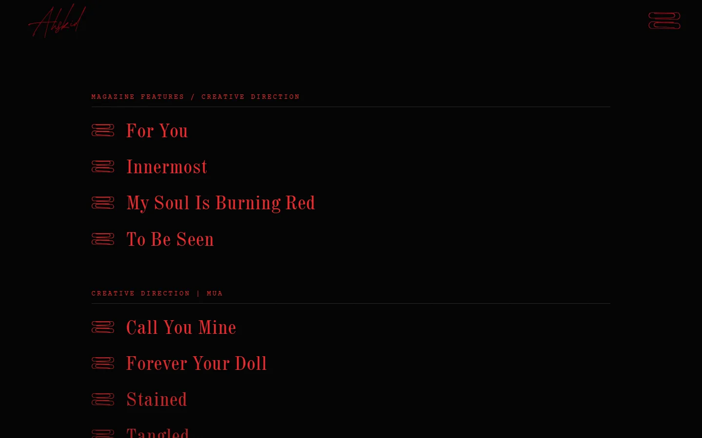
Thirty-seven shoots and 384 photographs, in the six sections of Diksha’s brief: Magazine Features / Creative Direction, Creative Direction | MUA, Magazine Features, Editorials, Brand Campaign and Runway. Shoots that belong together sit under one name, like Adão and Etic School.
Every shoot opens in place
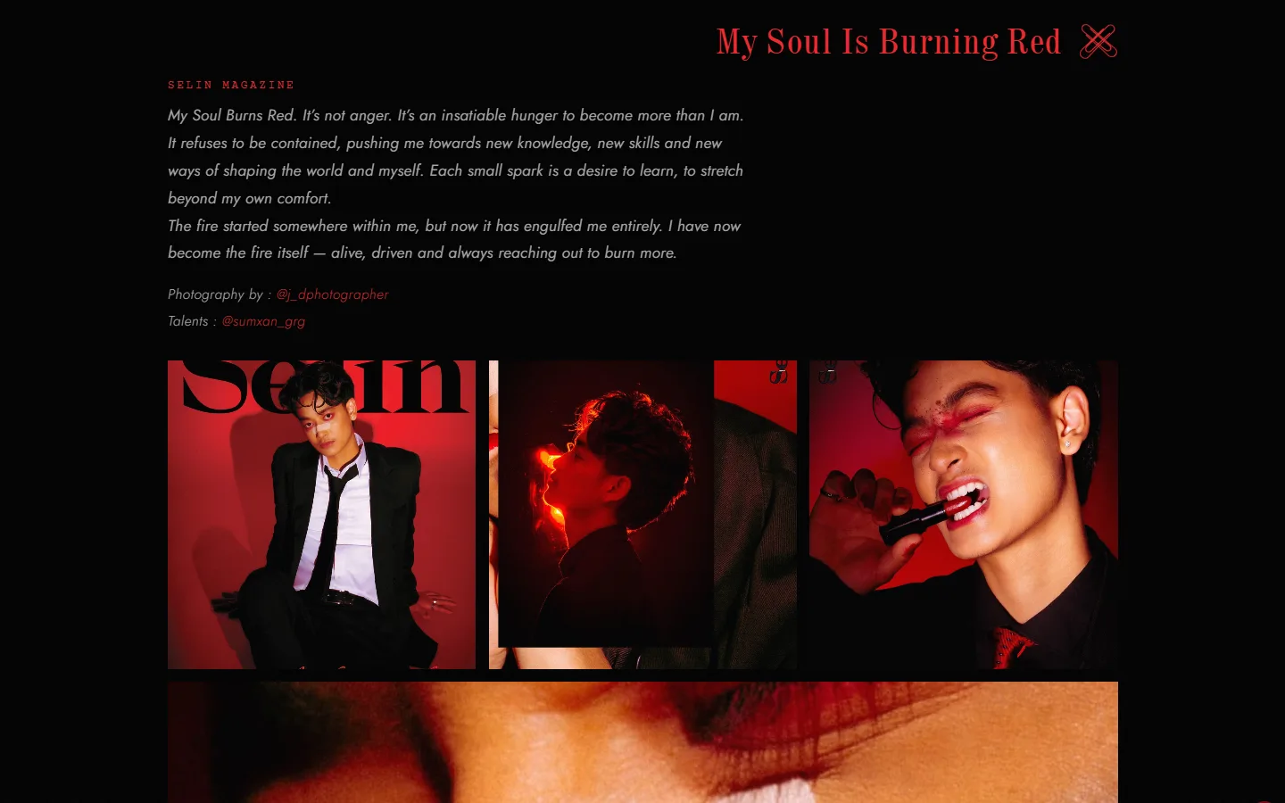
Diksha didn’t want a separate page for each project, so each one opens where it is. The title swipes right, and underneath come the publication, Diksha’s own statement about the shoot, the credits, and the photographs. The crossed clips fold it away again in one motion.
Only what’s true
- A credit appears only where there is a real name to print
- Placeholder captions were removed, not left sitting in Diksha’s voice
- The publication is set as a masthead, so it reads as a fact and not as part of the writing
- Pages still waiting on real copy stay unlinked until it arrives
Contact, where people already talk
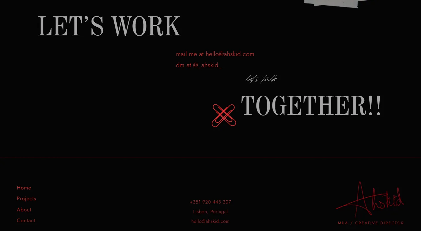
No form at the foot of the page. “Let’s Work Together!!” offers an email address, an Instagram DM, and a handwritten “let’s talk” that opens a WhatsApp chat with the first line already written.
Underneath
Next.js 15 on Cloudflare Workers. The archive comes straight from Diksha’s shoot folders: a build script turns 2.5 GB of originals into web-sized photographs and the data file the projects page reads, so adding a shoot is a folder and a line, and only the web images ship.
- 37
- 384
- 12
The outcome
Every shoot in one place, filed the way Diksha files it and written in Diksha’s words, on a site that looks like it came from the same hands as the work. Live at ahskid.com.
Next project
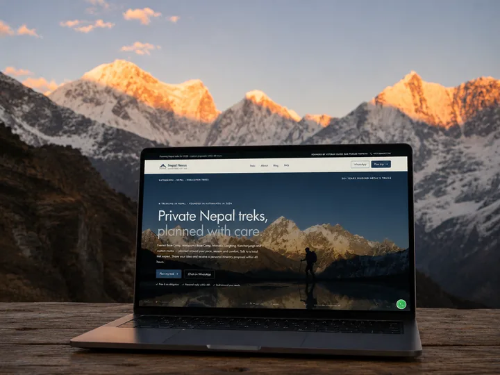
Nepal Nexus
A redesign for a Kathmandu trekking company, rebuilt around the guide who founded it.